

Hindi Ki Duniya School
Website Design
Project Background
Education is an investment in the future and it exemplifies how it is imparted.
When I came across a group that was working to start a non-profit cultural school teaching 'Hindi' an Indian language, it motivated me to do something as a responsible citizen.
Understanding the requirements with the group and the demographic targeted I worked on developing the 'Hindi Ki Duniya' portal. It was meant for the teachers and parents as a common platform where the progress of the student can be outlined. Methods to improve the skills and take the students to the next level of education were focused. Recording of the events and the session was focussed on offline learning.
Role UX/UI Design, Visual Design
Tools. Adobe XD, Illustrator, Dreamweaver, Zeplin
Goals Create a new website for a language school
Target Audience
Primary school children of Indian origin who do not speak the language Hindi.
Second and third-generation parents from South Asian community wants to introduce their kids Indian language - Hindi
Individuals or grad students who want to learn a new language as an interest in a new culture or part of a grad school program.
Interviews
We conducted interviews with families and individuals to get a better understanding of the client's requirements.
User research questions asked:
-
What are your expectations from this program?
-
What main features do you look for on the website?
-
The goal do you want to achieve?
-
How much time does it take for you to reach what you were looking for?

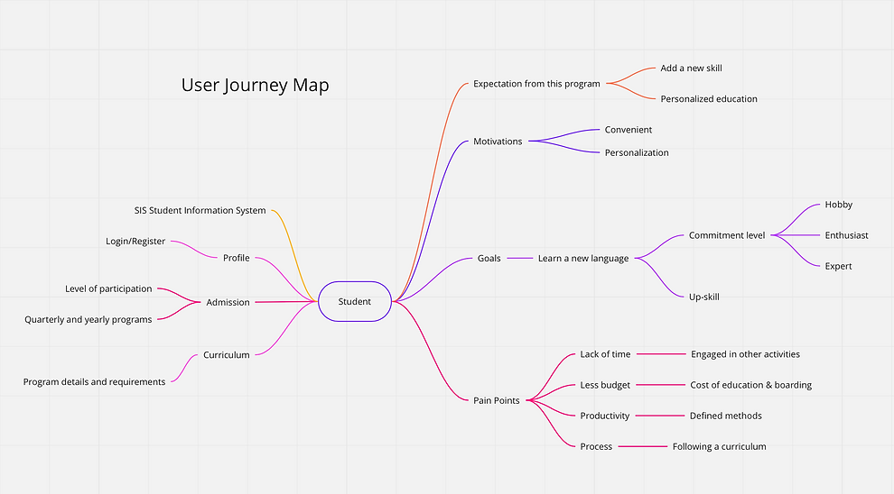
Personas
-
Created user personas after interviewing students and parents, and referred these personas through different stages of designing and developing the website.
-
While creating personas, I used data from in-person user research.
-
Goals & Frustrations about the user were provided in the persona to help establish pain points and points of interest and needs.
-
The personas were used most during UI Design and Prototyping.
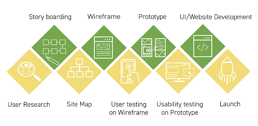
Design Process
It meticulously involved the distribution of the content on different pages based on the research collected. The website idea was to keep it simple and clearly state the purpose of each page. That will help users to spend more time absorbing the content rather than spending time searching for what they were looking for.
Low Fidelity Wireframes

UI Design & Mockups
After all the usability testing was done, I started designing the final screens in Adobe XD. I have highlighted the major features and flows.
-
Visually, I chose a light/pastel theme with more playful colors, fonts, and shapes.
-
I was inspired to use this style in the hopes to create a happy environment.
-
Yellow is a color of happiness, enlightenment, and creativity
-
Green is a color of growth and renewal.


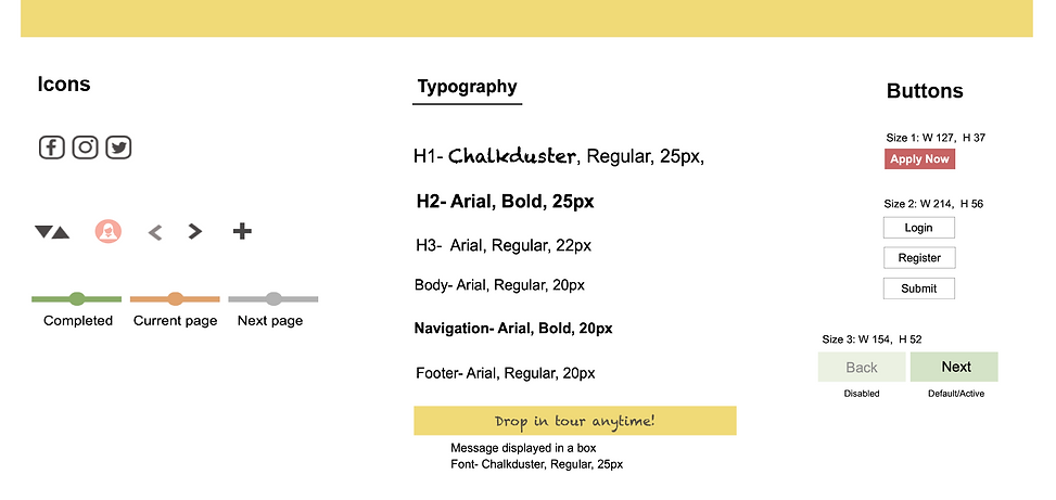
Style Guide
Chosen elements and color choice provide the user with a sense of playfulness

© 2024 by mathursurabhi.com